
case studies
Kitu.

2026
PROJECT OVERVIEW

the brief
Kitu needed a calm, minimal brand presence that could feel clean, trustworthy, and refined within the skincare space.
THE DIRECTION
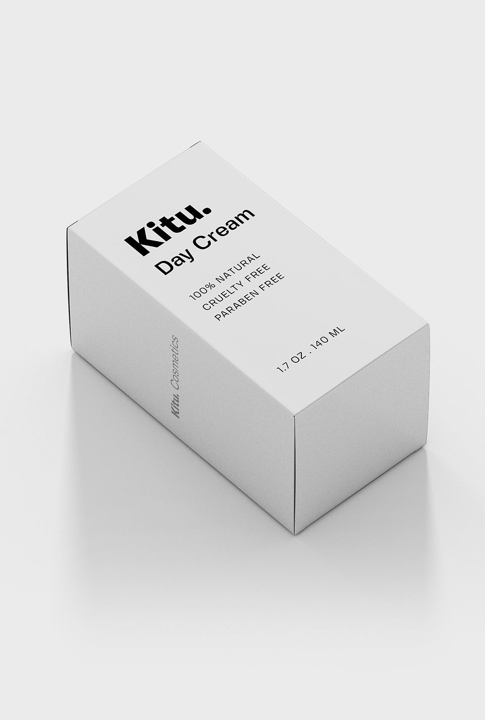
The direction focused on sharp typography, soft neutral tones, and simple packaging to create a more polished, clinical, and elevated feel.
result
The final result feels clean, cohesive, and quietly premium, giving the brand a stronger sense of trust across packaging and visual identity.
KEY FOCUS
What Shaped the Work
Kitu was developed as a skincare concept built around calm, clarity, and a refined visual presence. The goal was to create a brand that feels clean and trustworthy without relying on excess.
The direction centered on reducing visual noise through sharp typography, soft neutral tones, and minimal packaging. Each element was designed to feel clinical, balanced, and easy to understand.
The result is a brand presence that feels subtle but confident, with consistent details across packaging and visual identity.